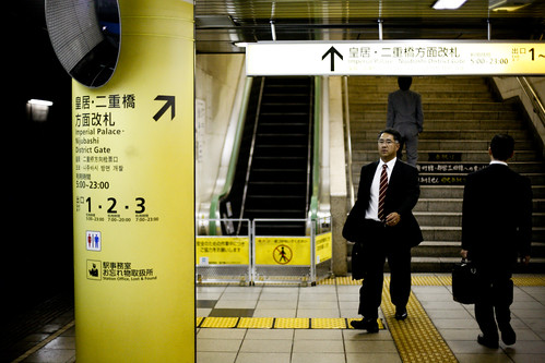
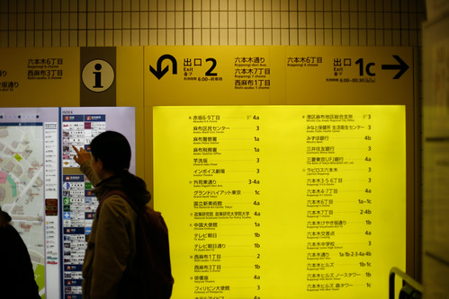
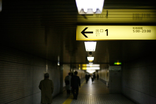
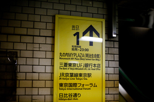
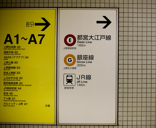
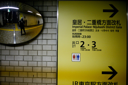
This is for my fellow appreciators of good wayfinding/signage systems. Anything to do with exiting the metro is in yellow/black type. It is so easy to follow you just have to pay attention. I'm sure even if i didn't use the NYC transit it wouldn't take me that long to figure it out.
The best part of this system is that they name each exit with an alphanumeric character. So if there are four exits it will have A1 - A4 along with a map of the streets above. So much easier than saying southwest or northeast exit.
How beautiful is the typography? Does anyone know who did this?
*update: so i was leaving JFK and noticed their exit signs were similar (yellow and black) I guess i never noticed them because i never really needed visual cues other than the words.